
Case Study
Prototype
About goodreads
Goodreads is the world’s largest social cataloging platform for readers, yet its interface has remained largely frozen in time. As a user for over five years, I’ve experienced firsthand the friction between its users and its dated usability. This passion project is a deep dive into improving the Goodreads experience.
Overview
The Project aims to eliminate the friction and frustration of book tracking on Goodreads, tackling challenges like a dated interface, cluttered navigation, and a fragmented mobile experience.
Process

Phase 1:
Discover
Conduct user research
Competitive analysis
Key process audit
User Research
I conducted research through an online survey with 11 users and 3 qualitative user interviews to understand how readers use the app, what motivates continued use, and where friction occurs.
Key Findings
Discovery & recommendations feel inaccurate and irrelevant; users want more personalized, swipe-based discovery.
Social features are difficult to use, with limited interaction and friction in finding or adding friends.
Tracking tools are useful but poorly organized, making it hard to categorize or reflect on reading habits.
UX and visual design feel outdated, unintuitive, and unengaging.
Small gaps like the lack of ½-star ratings create disproportionate frustration.
Competitive Analysis
I analyzed comparable platforms to understand how strong discovery, personalization, and social interaction patterns are successfully communicated through UX, visual design, and interaction models.
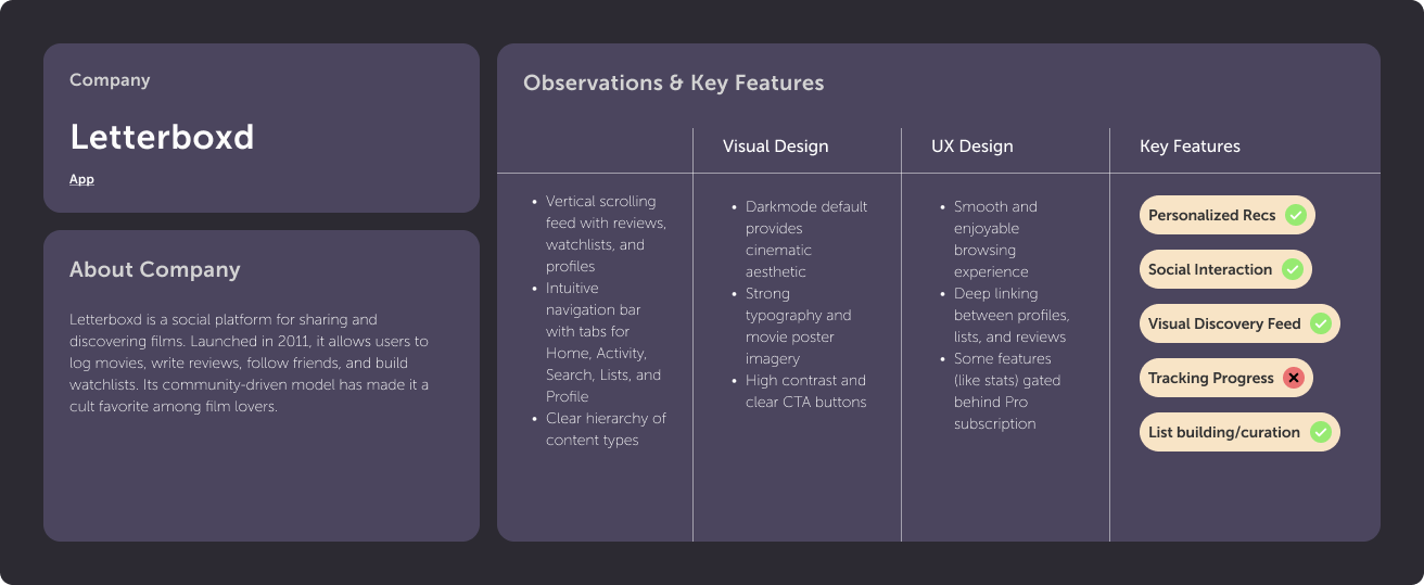

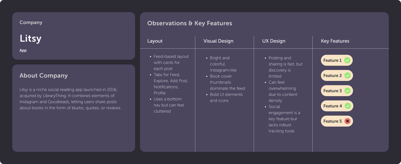
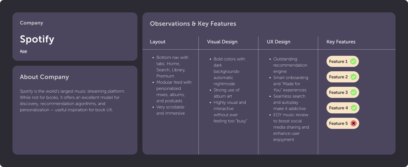
Key Findings
Personalization drives engagement: Platforms like Spotify and StoryGraph excel by surfacing tailored recommendations.
Social works best when it’s lightweight: Letterboxd succeeds by making social interaction feel natural and low-effort.
Visual discovery matters: Strong imagery and feed-based layouts make browsing feel enjoyable and intuitive.
Clear navigation builds trust: Apps with focused, uncluttered navigation feel more polished and easier to adopt.
Fun increases retention: Swipe interactions, end-of-year summaries, and badges turn tracking into a rewarding experience.
Key Process Audit
I audited the end-to-end process of logging and reviewing a finished book to identify usability breakdowns, navigation friction, and moments of unclear hierarchy disrupts an otherwise core user flow.
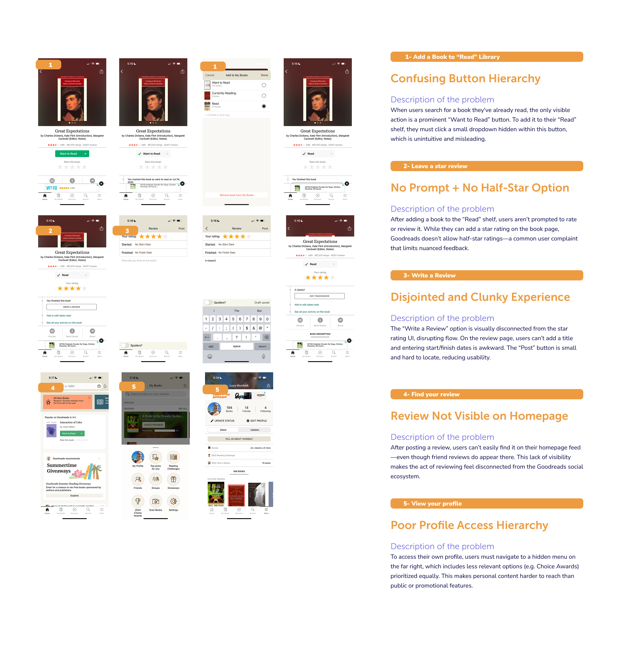
Key Findings
Core actions like adding a book to “Read” are hidden behind unintuitive button hierarchies, causing confusion even for experienced users.
Users are not prompted to rate or review after finishing a book, breaking momentum at a key engagement moment.
The lack of ½-star ratings limits users’ ability to express nuanced opinions.
The review-writing experience is fragmented, with disconnected rating, metadata, and text entry flows.
Posted reviews are not surfaced on the user’s homepage, reducing the perceived value of contributing.
Profile access is buried in secondary navigation, making personal content harder to reach than less relevant features.
Phase 2:
Define
Create eser persona
Synthesize and define goals
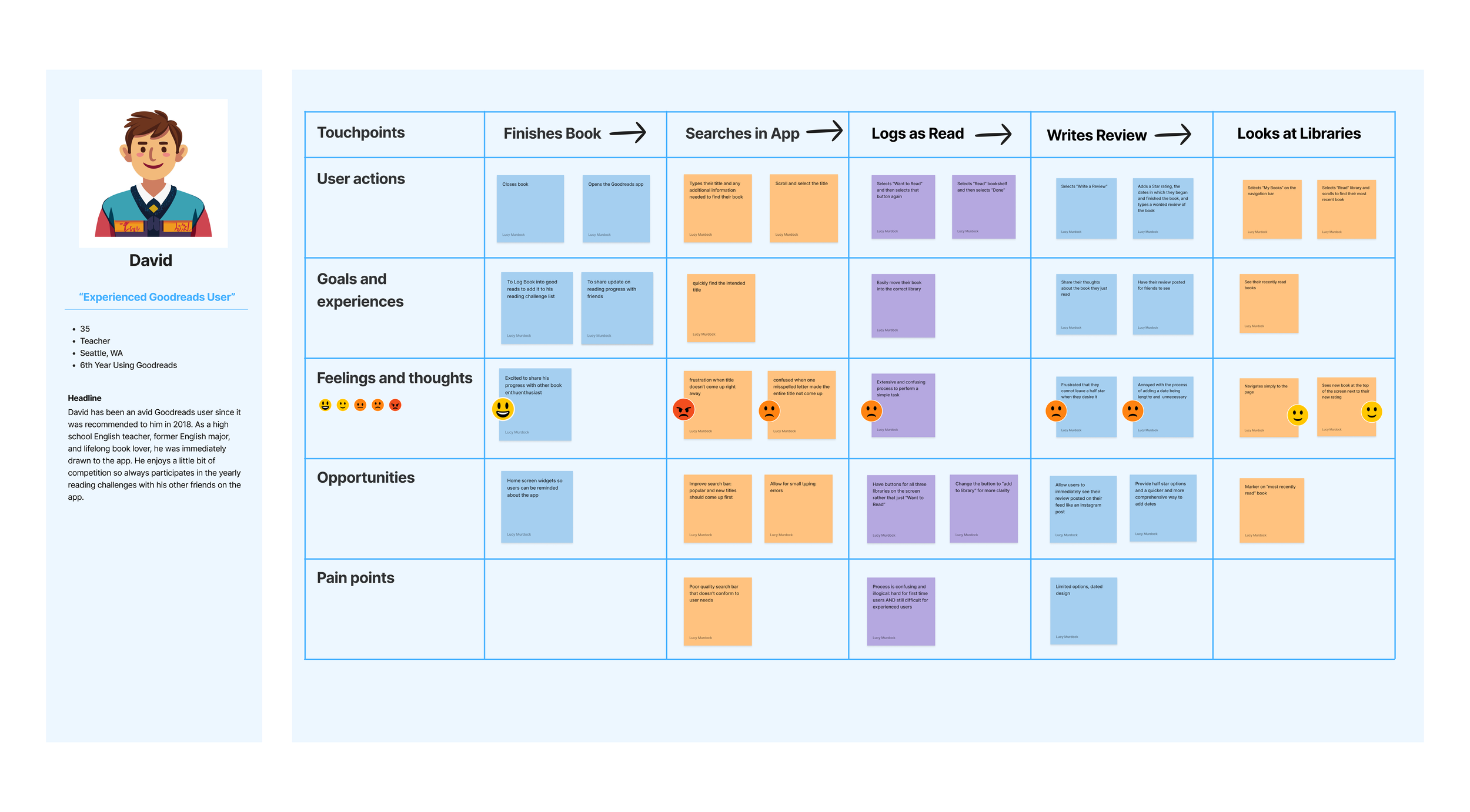
User Persona
I created a user persona to capture the goals, behaviors, frustrations, and motivations of an experienced Goodreads user, highlighting pain points in search, navigation, and library management.
Synthesis & Goals
User research revealed that while the app provides core reading-tracking functionality, engagement is hindered by clunky social features, weak discovery, unintuitive navigation, missing tools, and outdated visual design. Users want experiences that feel personalized, playful, and community-driven, with meaningful recommendations, social connection, and accessible tracking tools. Addressing these gaps can transform routine reading tasks into a more engaging, rewarding, and social experience.
Project Goals
Foster Social Connection & Community: Simplify friending, enable interactive features like comment replies and shared reading notifications, and introduce badges to encourage engagement.
Create Personalized & Relevant Feeds: Highlight shared reads, similar ratings, friends’ current books, and milestones.
Encourage Playful Discovery: Introduce swipe-based browsing, themed categories, and gamified exploration.
Simplify Navigation & Search: Make core actions easily accessible and restore missing features like .5 ratings and challenges.
Enhance Visual Appeal & Trust: Refresh UI to be clean and playful.
Phase 3:
Ideate
Create task flows and charts
Design lo-fi wireframes
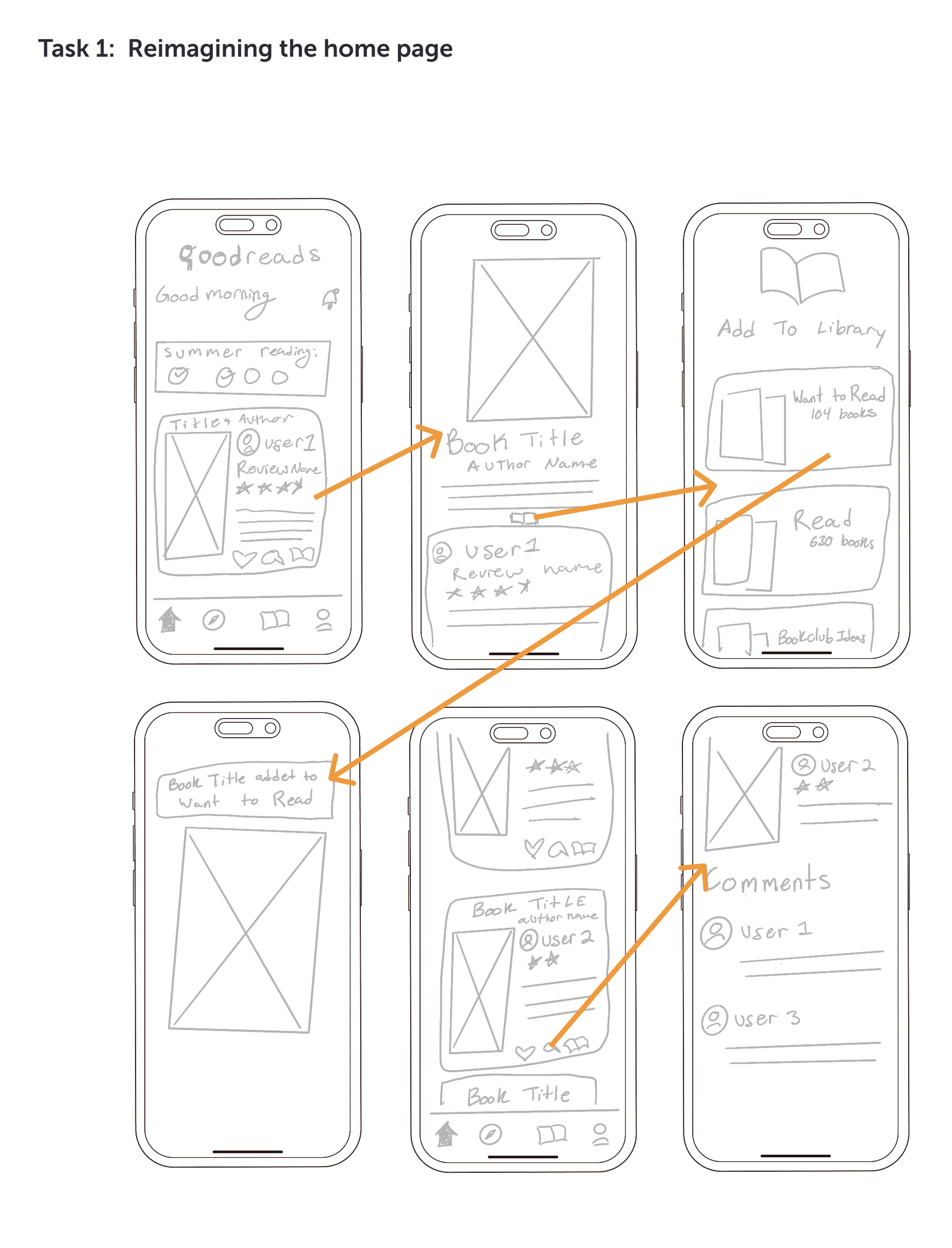
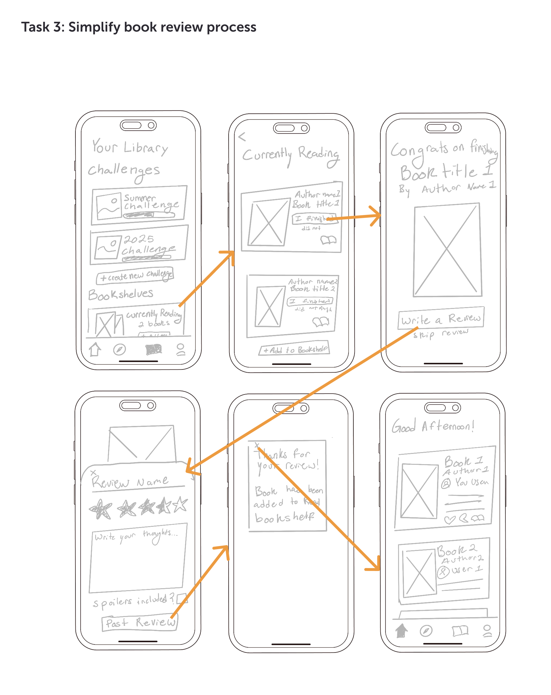
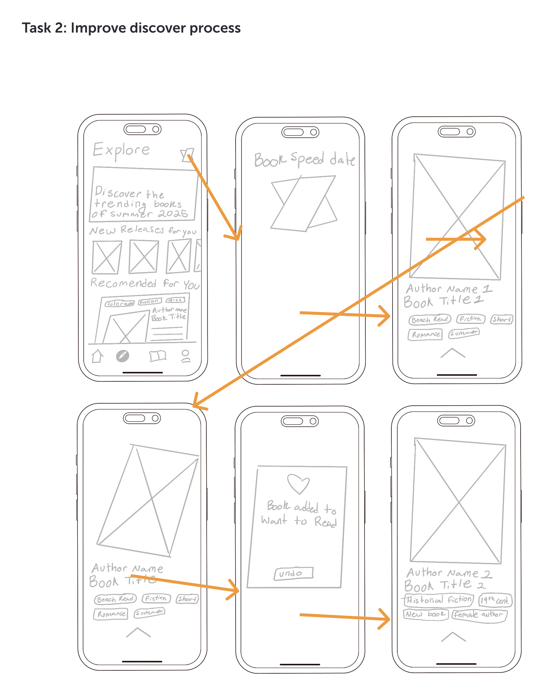
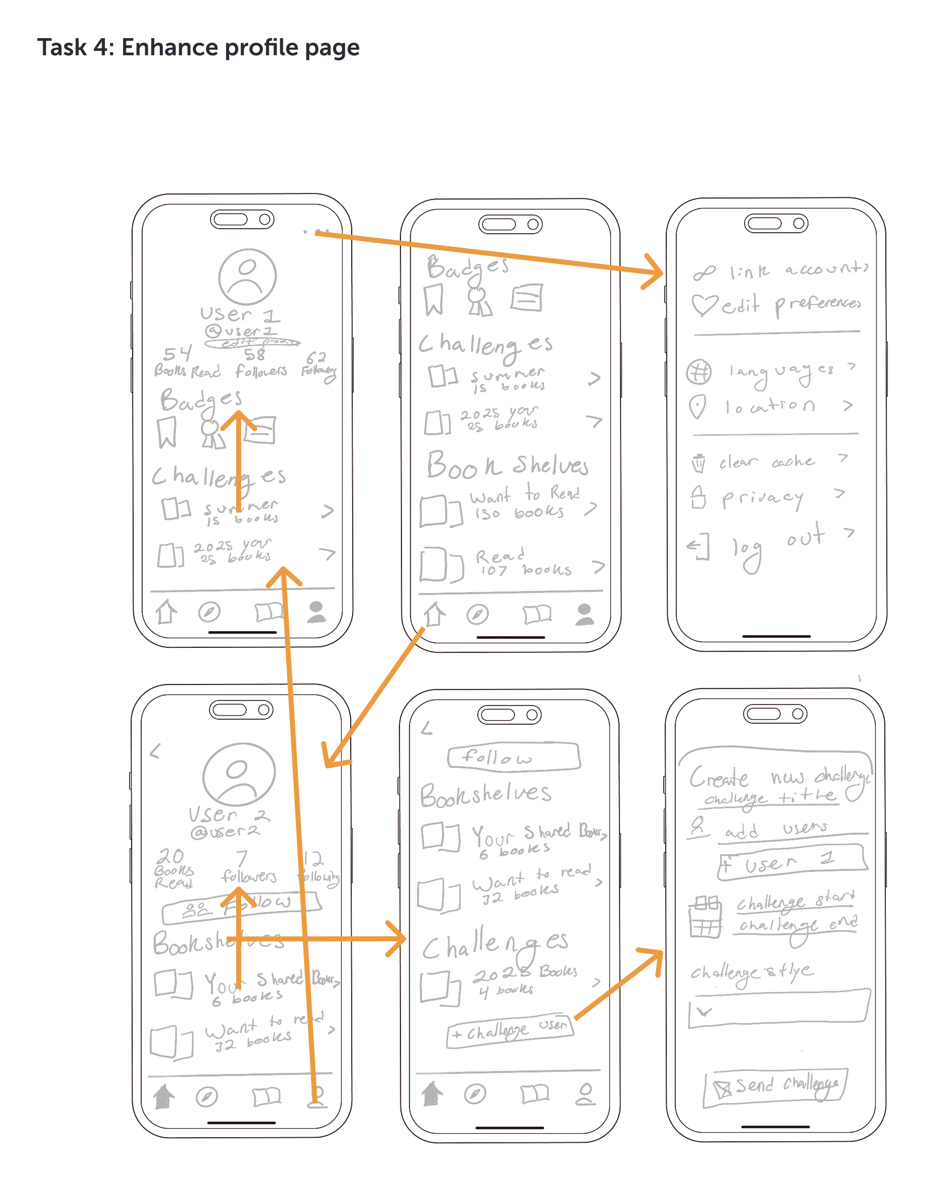
Taskflows & Wireframes
I identified four key task flows that represent core user interactions and created detailed flow charts to map each step, uncover pain points, and visualize opportunities for improving efficiency and usability.
Phase 4:
Design
Brand Identity
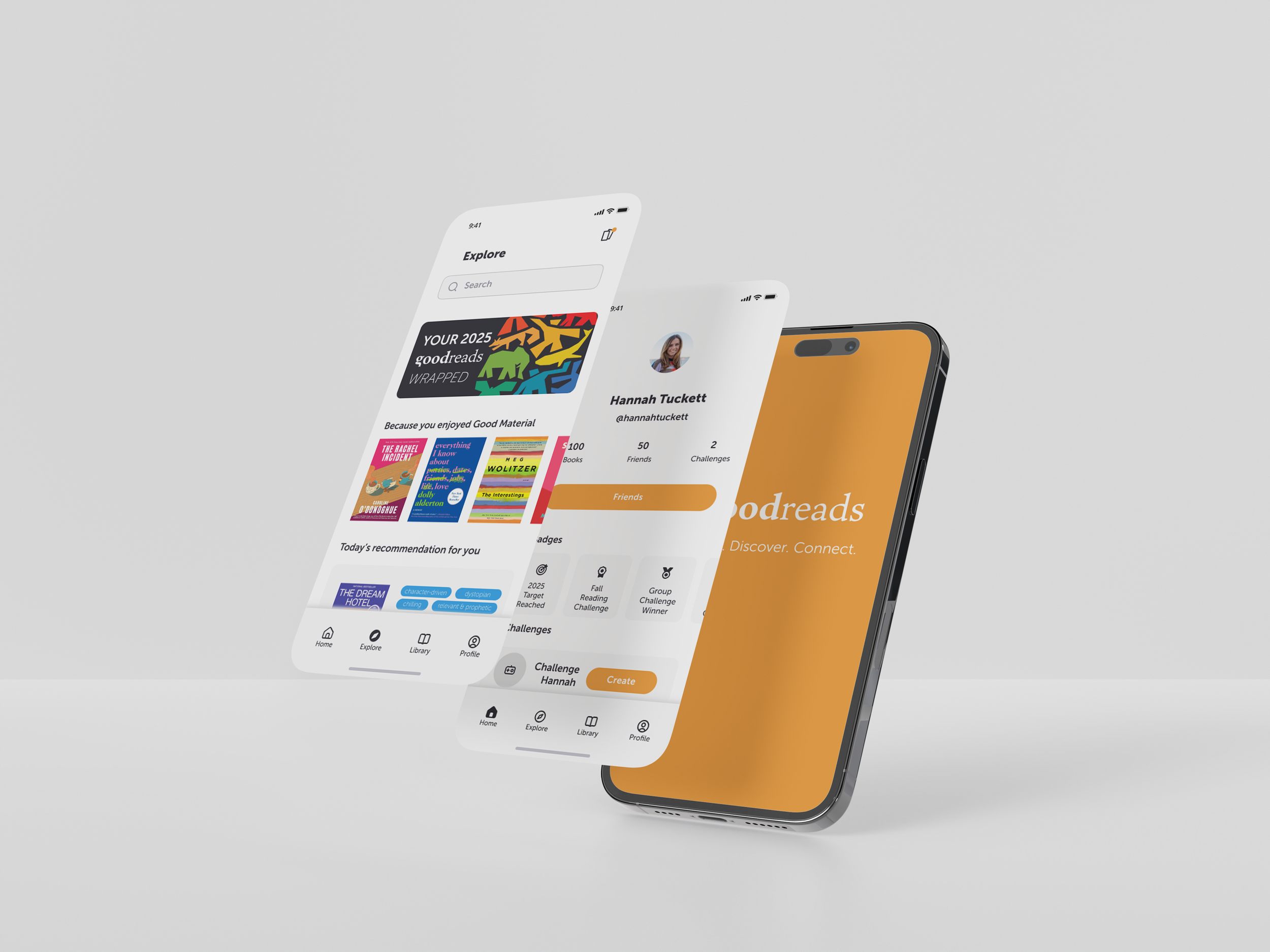
Hi-Fi Prototype
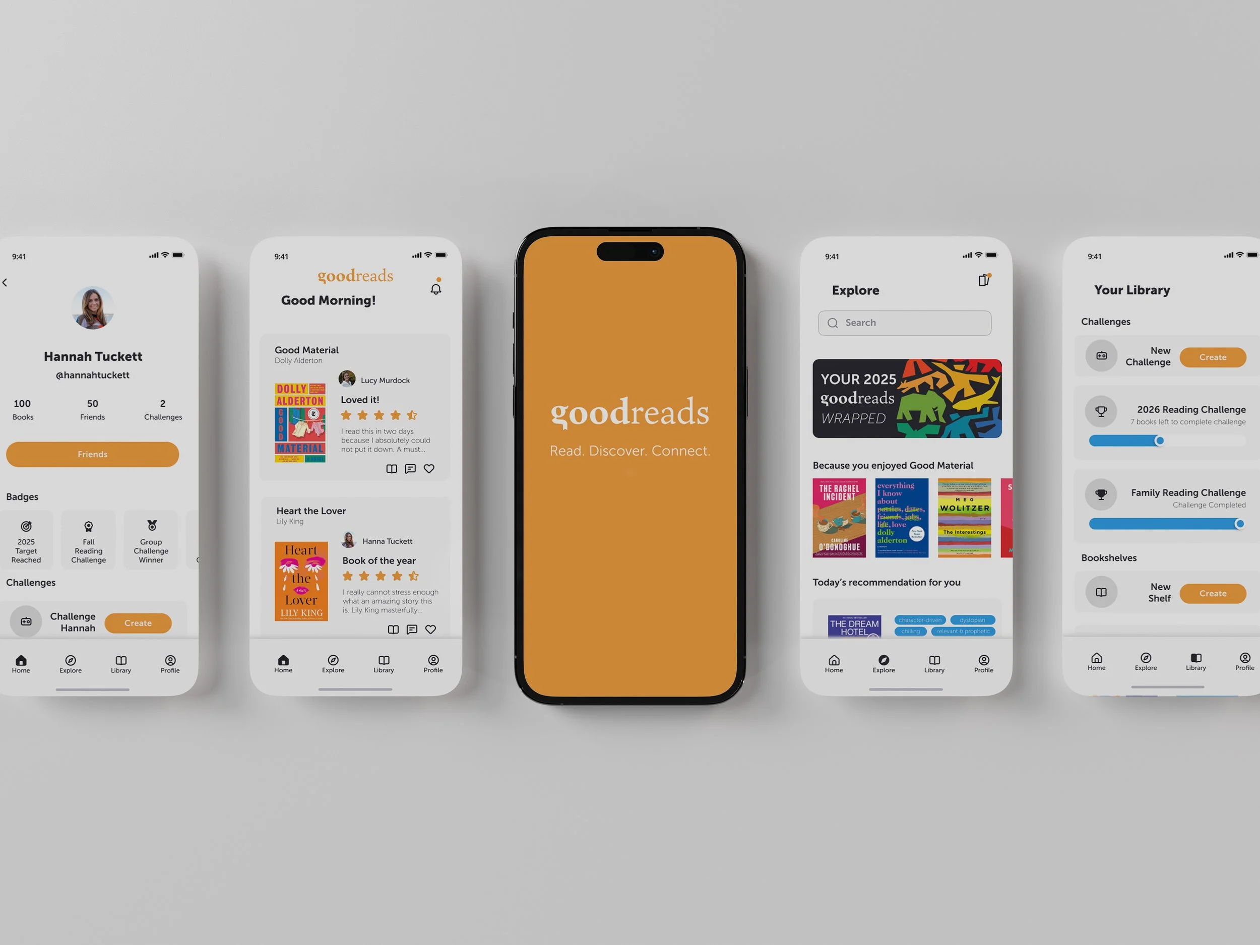
Brand Identity
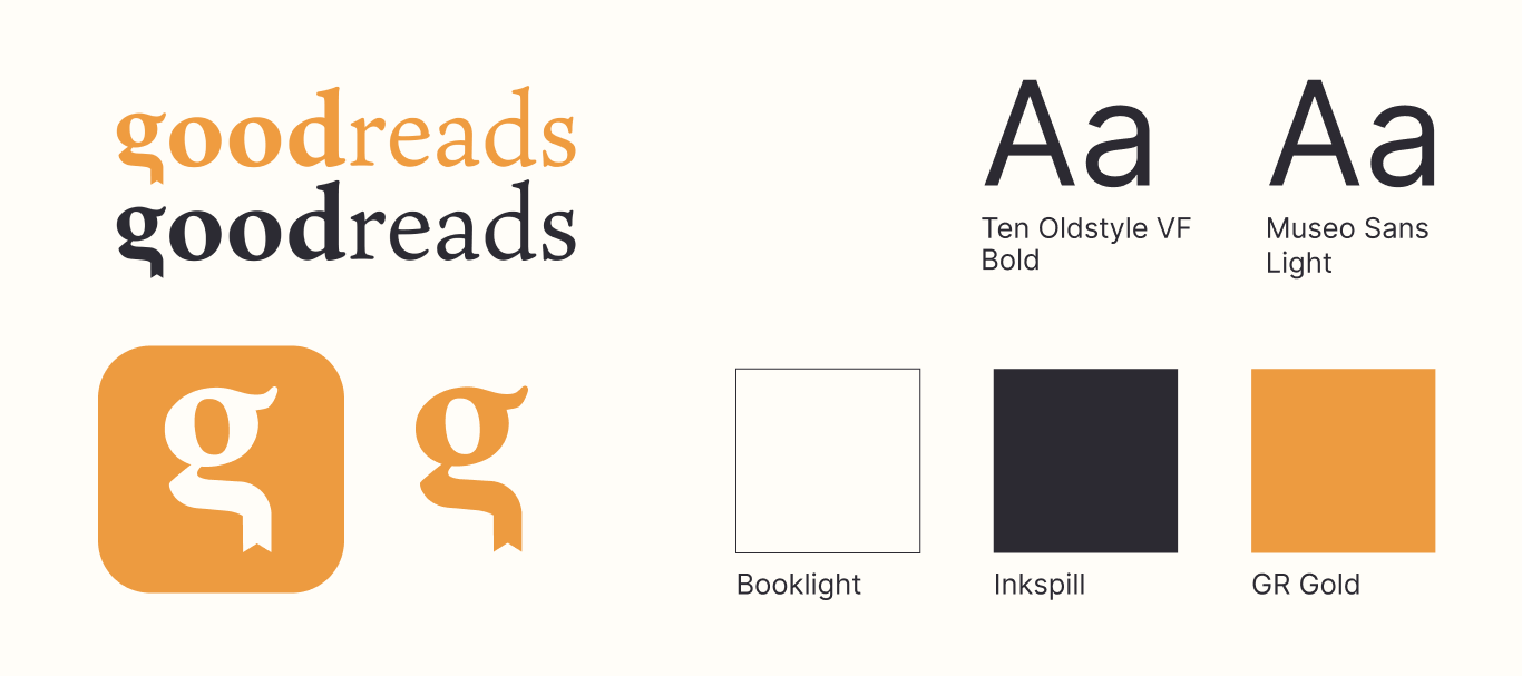
Hi-Fi Prototype
Impact
How did these design improvements enhance usability, engagement, and user satisfaction?
Work In Progress…
Fill out my survey here to share your feedback on the design: