
About goodreads
Challenge: Goodreads’ mobile experience feels outdated and fragmented, making book tracking, discovery, and social interaction harder than they should be.
Solution: A modern, user-centered redesign that streamlines core flows, introduces personalized and playful discovery, strengthens social interaction, and refreshes the visual system to increase engagement and retention.
Deliverables: Research & Strategy, User Experience Design, Product Design, Branding Design, Prototyping
Timeline
Oct - Dec 2025
Role
UX Design & Research
Org
Passion Project
Team
Solo
OVERVIEW
As a veteran user of both mobile app, I know all to well the frustrations of navigating the platform. Goodreads’ mobile app feels fragmented and outdated, making it harder for users to track books, discover new reads, and engage socially. I led a solo, end-to-end redesign to streamline core flows, introduce more personalized and playful discovery, strengthen lightweight social interactions, and refresh the visual system. I wanted the platform to be as fun to use as any social media available now. The result is a more cohesive experience designed to increase engagement, trust, and long-term retention between books.

How might we reconnect Goodreads’ fragmented tracking, discovery, and social features into a cohesive experience that builds momentum and encourages ongoing engagement?
USER RESEARCH
I conducted research through an online survey with 11 users and 3 qualitative user interviews to understand how readers use the app, what motivates continued use, and where friction occurs.
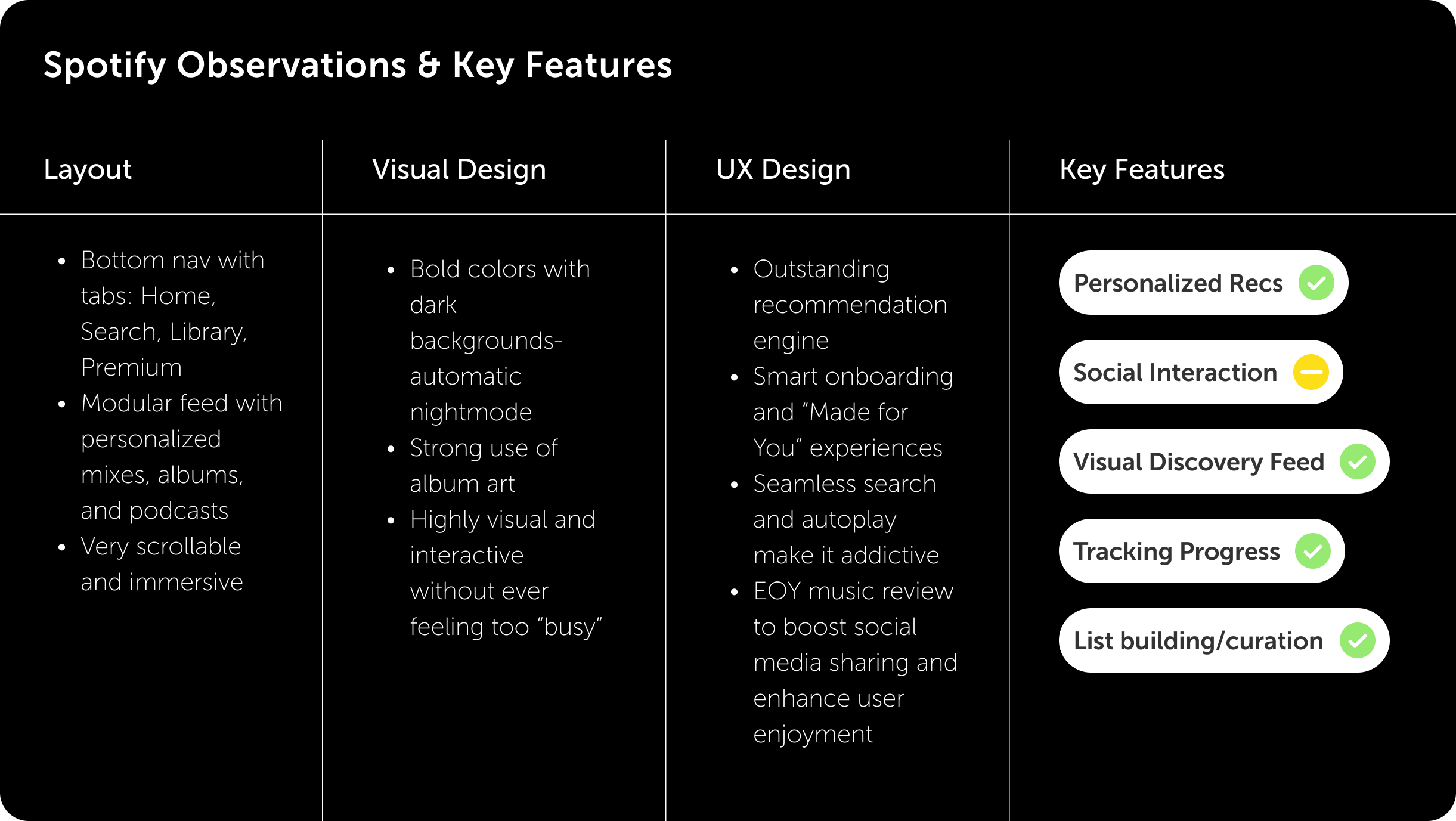
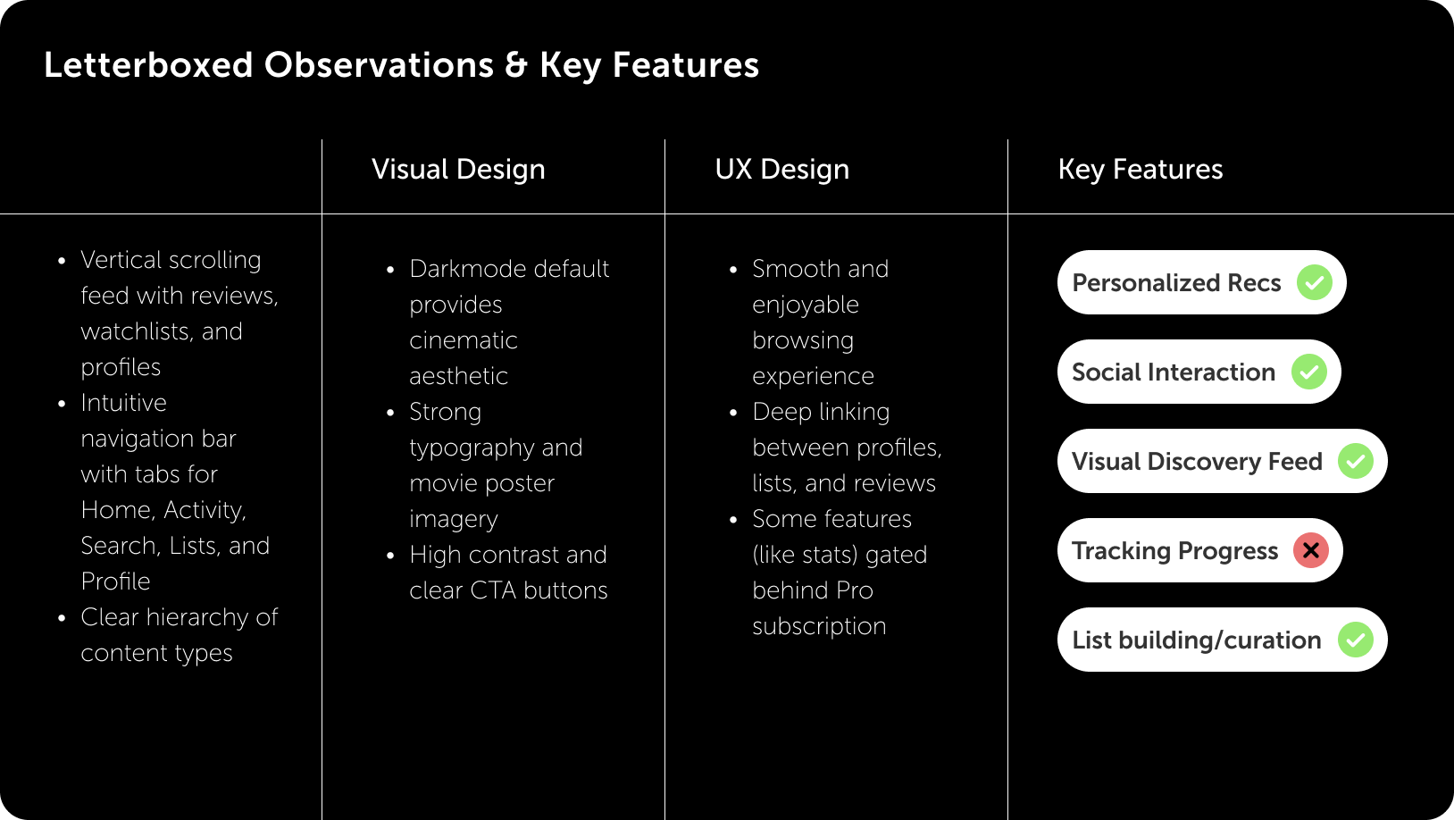
COMPETITIVE ANALYSIS
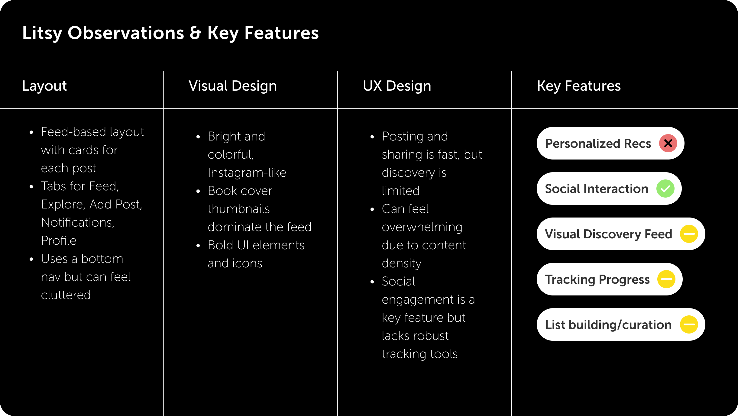
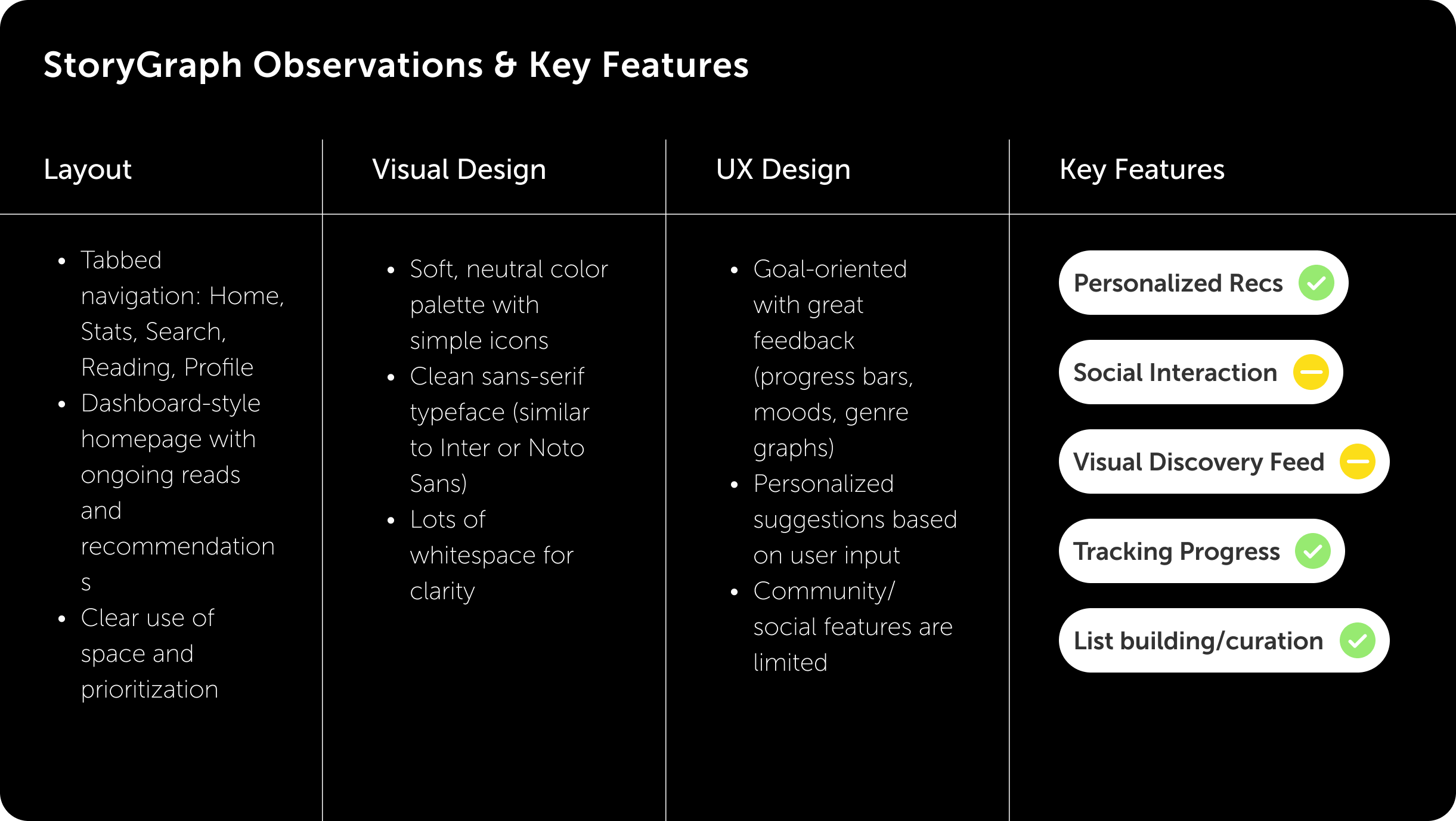
I used the competitive analysis method to compare apps with similar functions to Goodreads, reviewing the key features that emerged from the interviews and surveys; personalization of recommendations, social interaction, discovery feed, progress tracking, and list curation.
PROCESS AUDIT
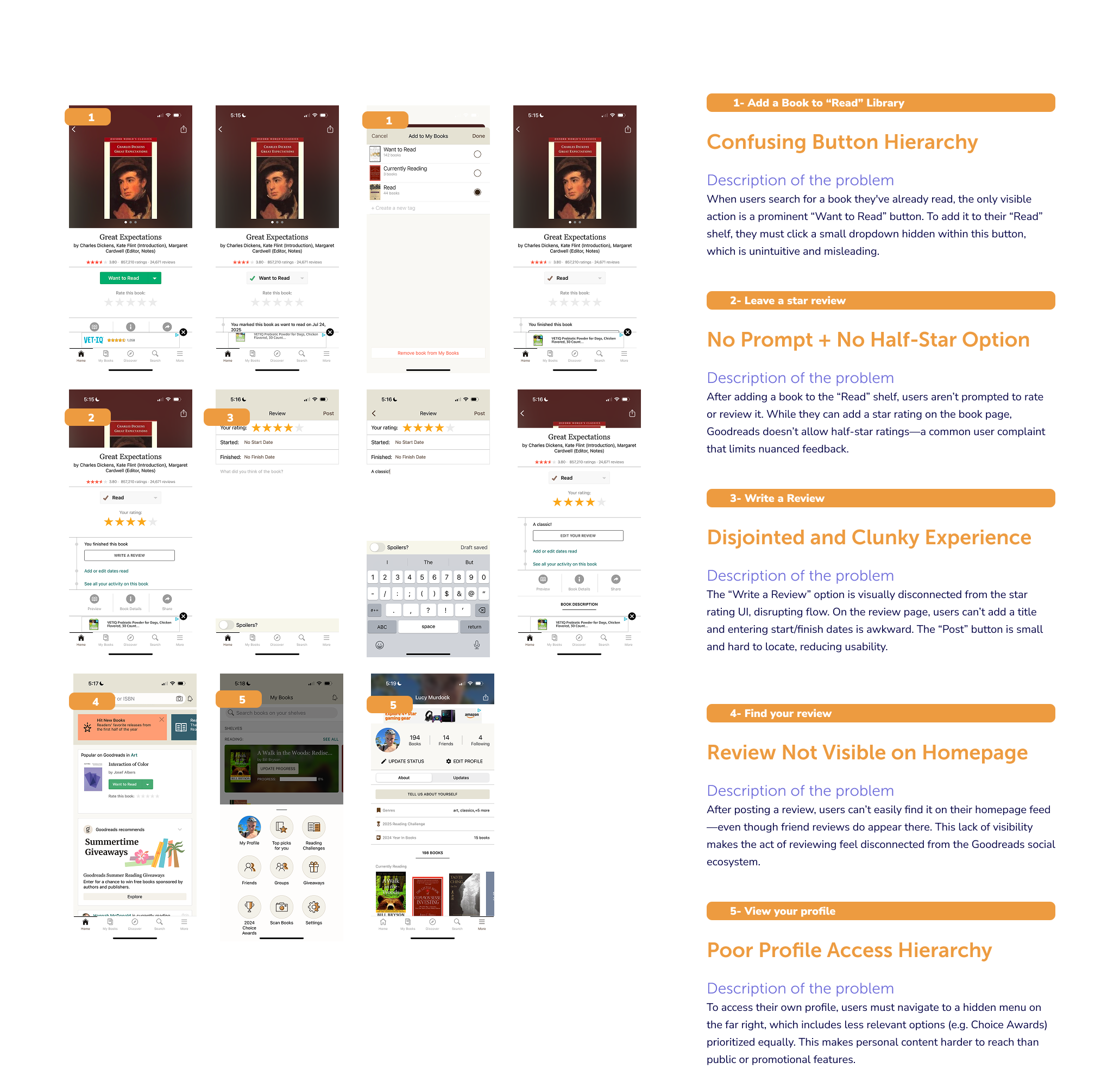
I audited the end-to-end process of logging and reviewing a finished book to identify usability breakdowns, navigation friction, and moments of unclear hierarchy disrupts an otherwise core user flow.
KEY INSIGHTS
Momentum Is Lost at Critical Moments
Finishing a book is a high-intent moment, yet Goodreads fails to guide users toward rating, reviewing, or continued exploration. Missing prompts cause engagement to drop.
Core Actions Are Hidden by Poor Hierarchy
Essential tasks like logging a book, accessing profiles, or updating reading status are obscured by unintuitive navigation and button hierarchy, slowing even experienced users.
Discovery Feels Generic and Misaligned
Recommendations often irrelevant; users respond better to discovery rooted in their reading history and shared interests.
Small Gaps Create Outsized Frustration
Missing details like ½-star ratings prevent users from expressing nuance and disproportionately impact satisfaction.
Social Interaction Is High-Value but High-Friction
Connecting with friends is a primary motivator, but social features are buried and difficult to use. Feed-based interactions reduce effort and make participation feel natural.
Visual Design Influences Trust and Engagement
Outdated visuals increase cognitive load and reduce perceived product quality. Clean hierarchy, strong imagery, and playful interactions signal credibility and invite exploration.
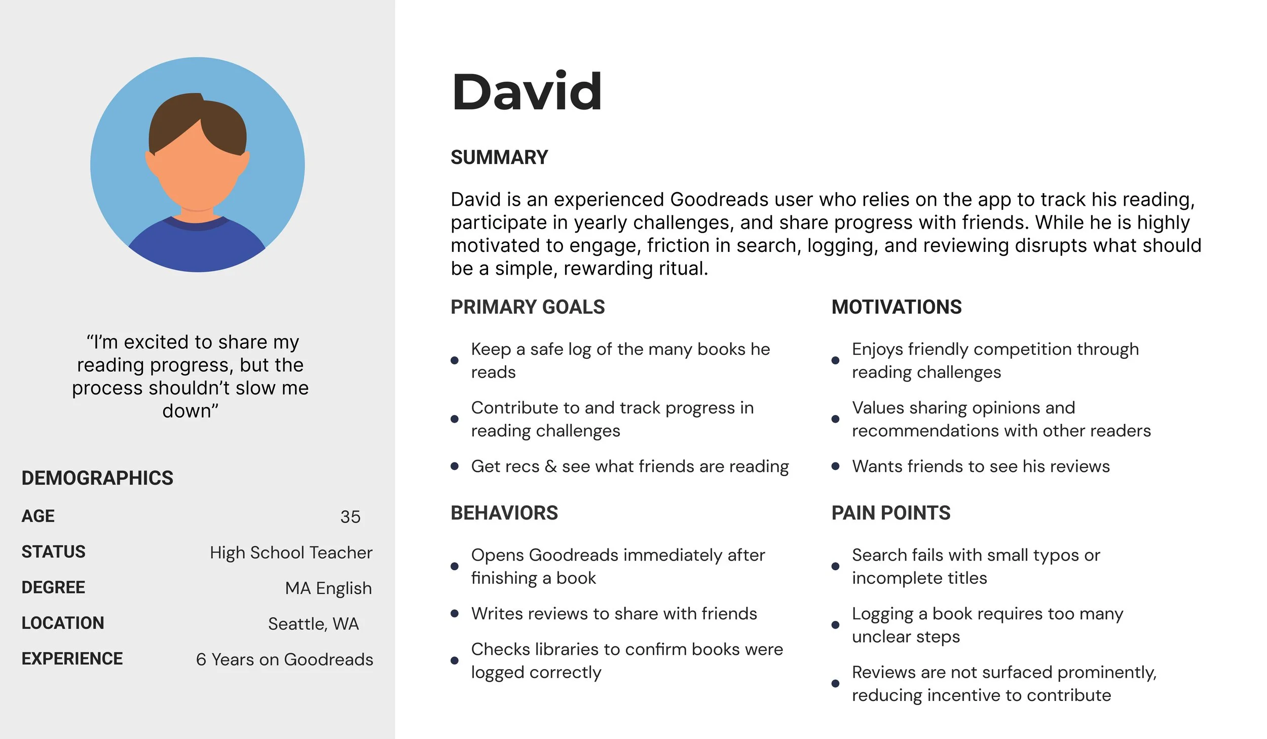
USER PERSPECTIVES
I created a user persona to capture the goals, behaviors, frustrations, and motivations of an experienced Goodreads user, highlighting pain points in search, navigation, and library management.
OPPORTUNITY AREAS
Guide users from finishing a book to rating, reviewing, and sharing without friction.
Personalize discovery by surfacing recommendations tied to reading history and friends’ activity.
Give the people what they need: half-star ratings.
Refresh and modernize visuals.
Design core actions with simplified navigation.
Improve social interaction through simplified flows and combined user libraries.
DESIGN FOCUS & SCOPE
I prioritized high-impact improvements that addressed the most significant usability and engagement gaps while remaining feasible for an MVP.
Primary focus areas
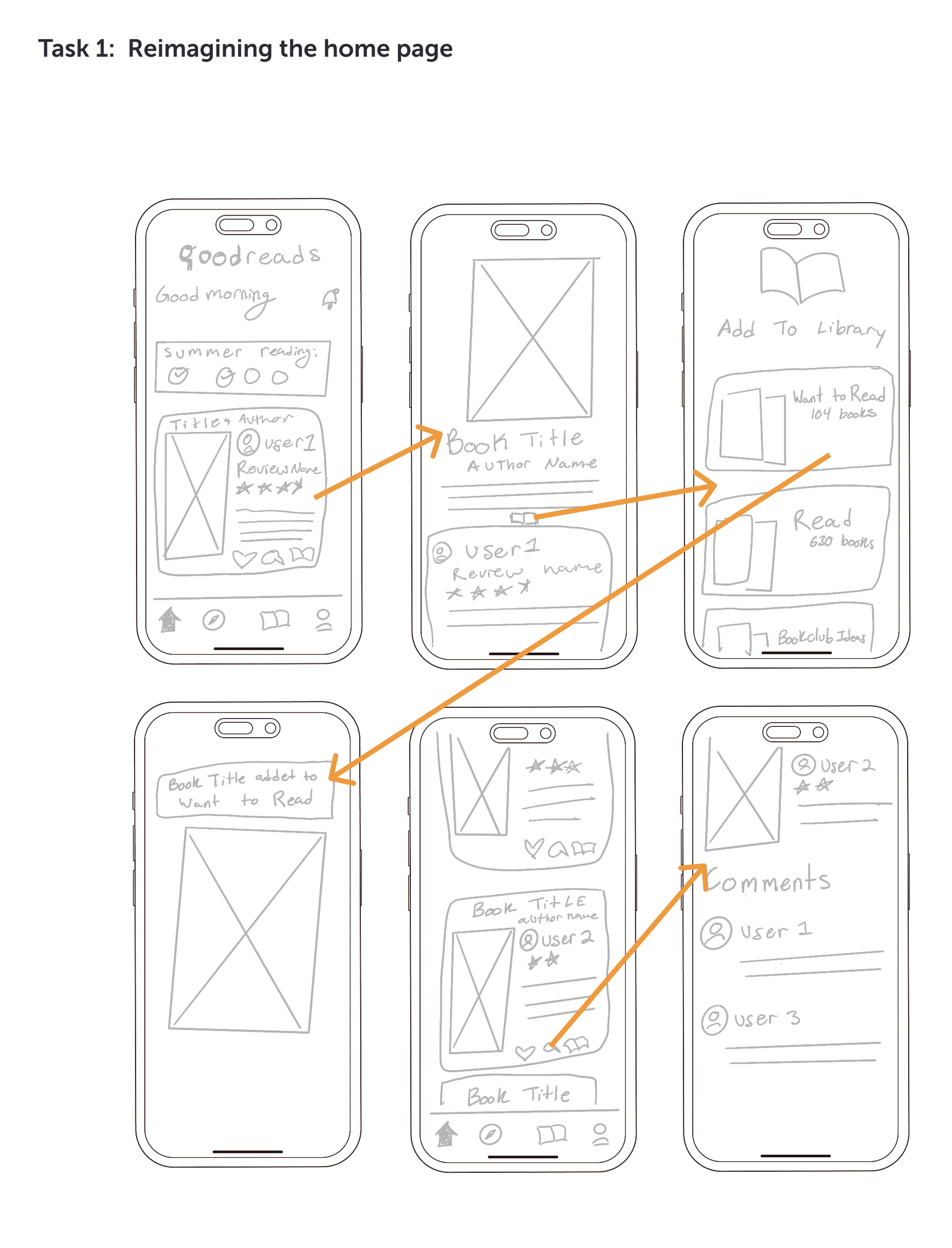
Simplifying the home experience and bottom navigation
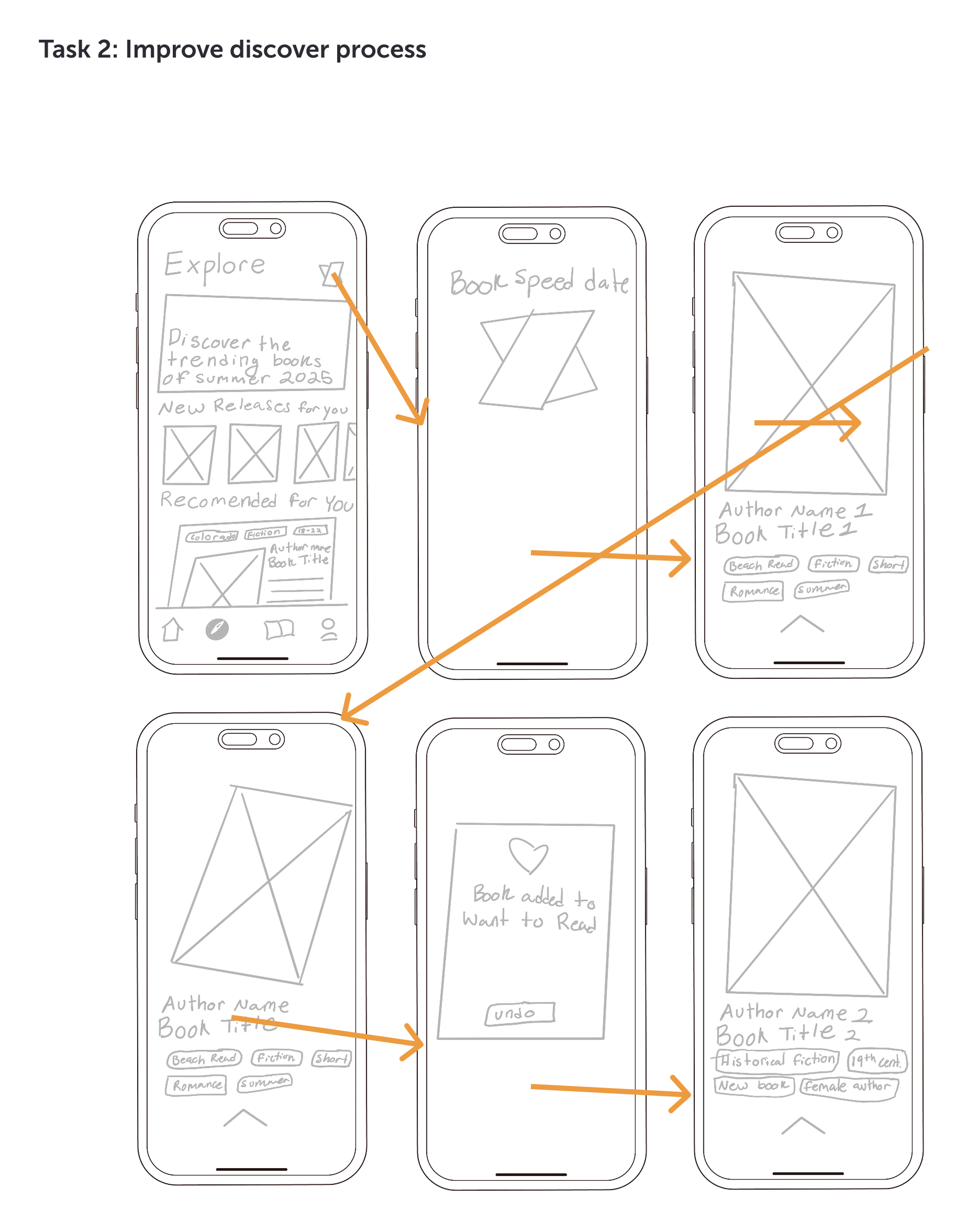
Improving the book discovery flow
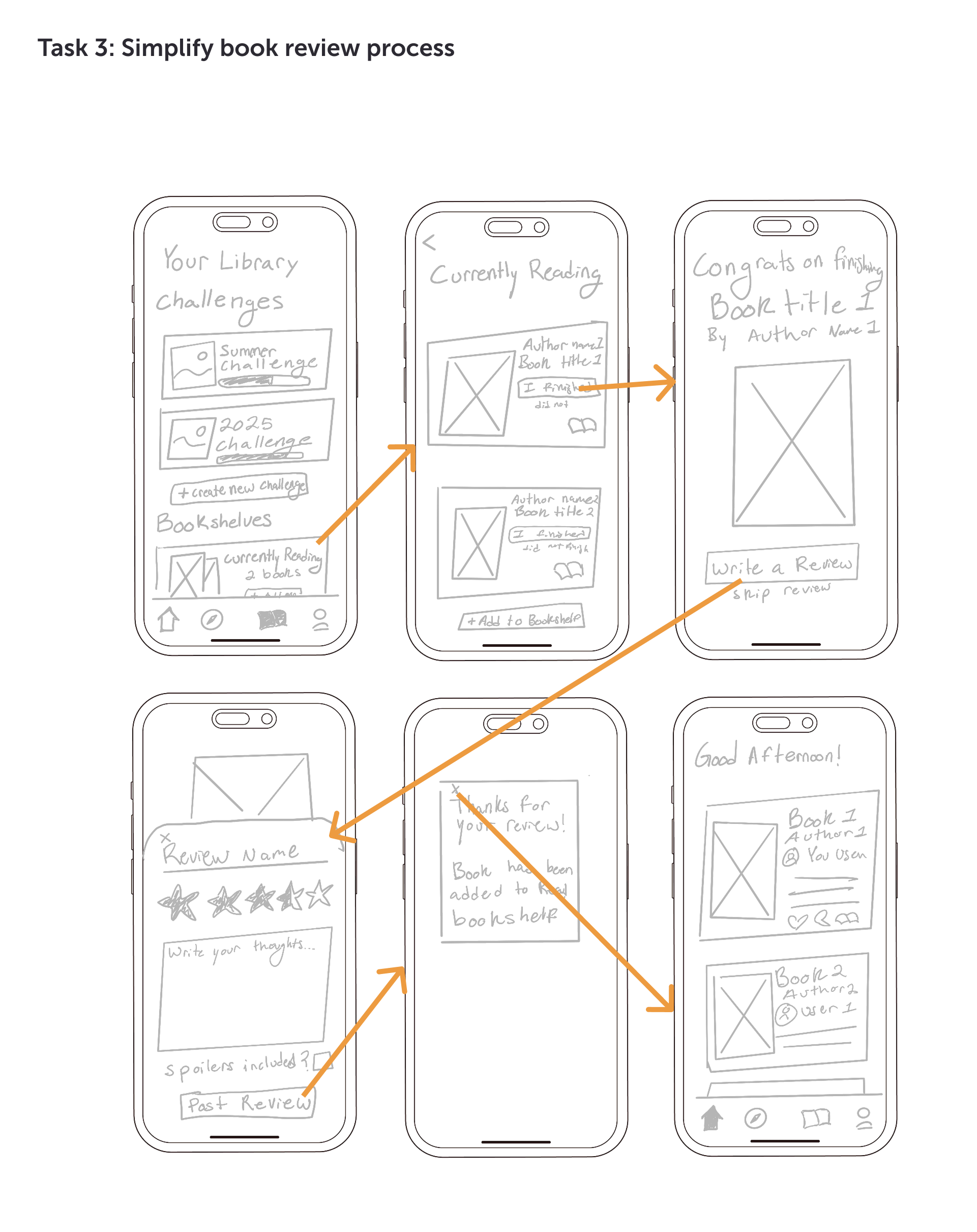
Streamlining the book logging and review process
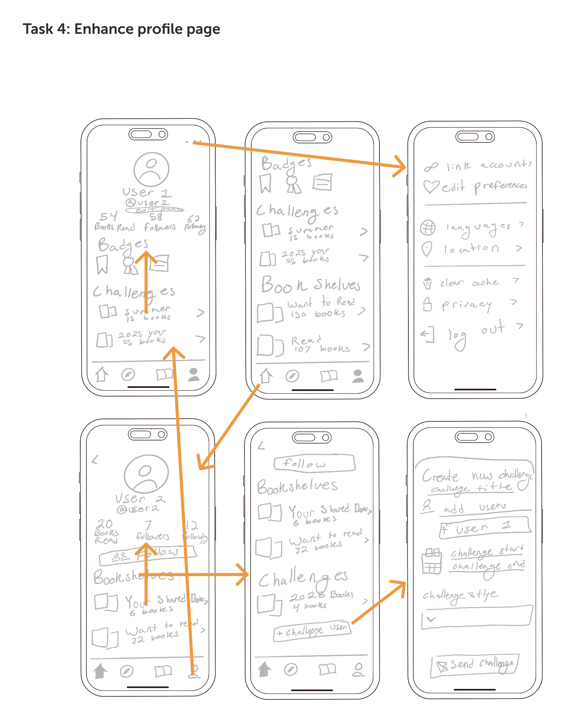
Enhancing profile pages to better surface personal content
Out of scope for this phase
Complex discovery mechanics
A fully built-out challenges system
These features were deprioritized due to lower immediate impact and higher effort, and were not essential for validating core usability and engagement improvements.
WIREFRAMES & TASKFLOWS
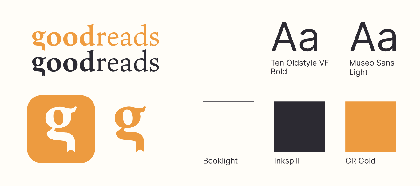
BRAND IDENTITY
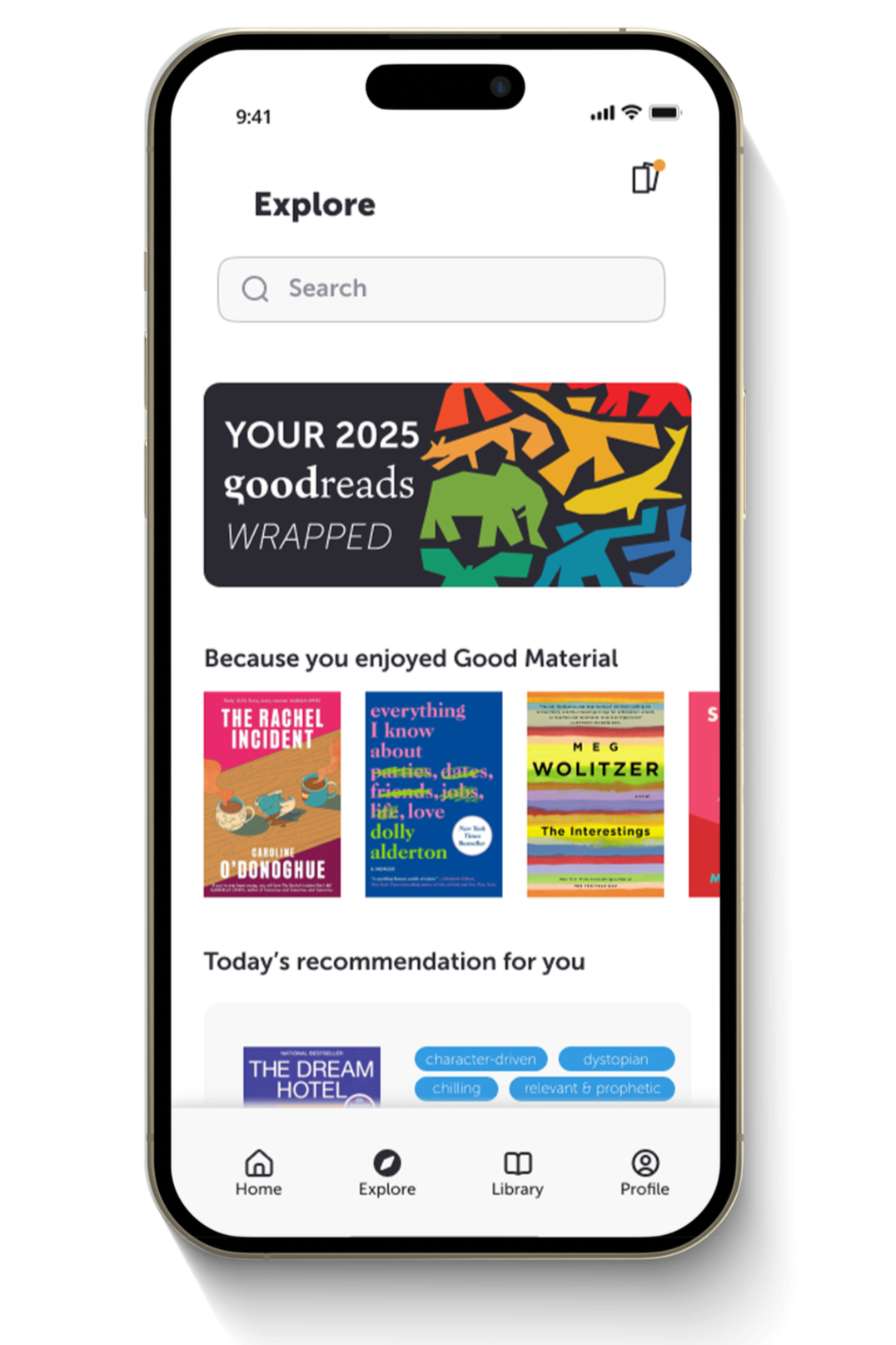
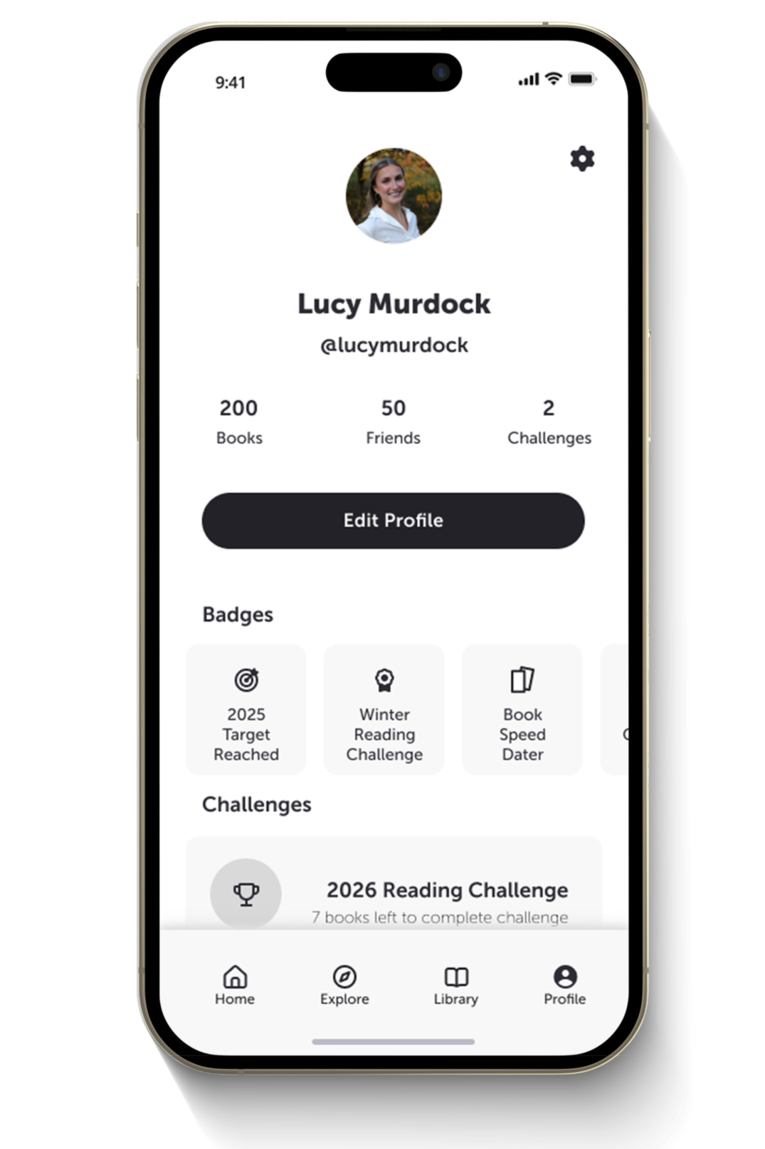
PROTOTYPE
I created a high-fidelity, interactive prototype in Figma to validate core Goodreads flows. The prototype focused on:
Simplifying book logging, rating, and review flows
Improving personalized and visual discovery
Integrating lightweight social signals into key moments
Enhancing profile pages to highlight recent activity
IMPACT
Post-prototype testing with 3 users showed increased engagement at key moments, with users more likely to rate and review when prompts and next steps were clearly surfaced. Personalized discovery and lightweight social interactions felt more intentional and easier to use, while a refreshed visual system and clearer hierarchy improved perceived product quality and reduced cognitive load. Together, these changes support stronger engagement between books rather than only at completion.
KEY TAKEAWAYS
Connecting fragmented moments builds momentum and increases follow-through.
Personalization adds value when user data clearly informs the experience.
Visual clarity directly influences trust and product credibility.