
About McTaggart’s
Challenge: Tagg’s Deli lacked a mobile ordering experience, making it difficult for customers—especially groups—to efficiently place, customize, and coordinate orders. This led to friction in high-demand scenarios and missed opportunities to better serve their core user base.
Solution: A mobile-first, user-centered ordering experience that simplifies individual and group orders, streamlines customization, and makes coordination intuitive. The redesign prioritizes speed, clarity, and shared ordering flows to better match how customers actually order from Tagg’s.
Deliverables: User Experience Design, Product Design, Branding Design, Prototyping
Timeline
Jan - Apr 2026
Role
UX Design & Research
Org
McTaggart’s Deli
Team
Solo
OVERVIEW
Tagg’s Deli had no mobile ordering, making it difficult for customers—especially groups—to place and coordinate orders efficiently. The in-person process was time-consuming and lacked flexibility for customization and quick reordering.

How might we design a more efficient way for customers to order from McTaggart’s Deli individually or as a group so the experience feels effortless, personalized, and enjoyable?
OPPORTUNITY AREAS
Design a group ordering system that is easy to create, join & manage orders
Streamline the ordering flow to reduce friction
Enable quick reordering by prioritizing past orders and favorites
Create a hub to highlight daily deals and promotions
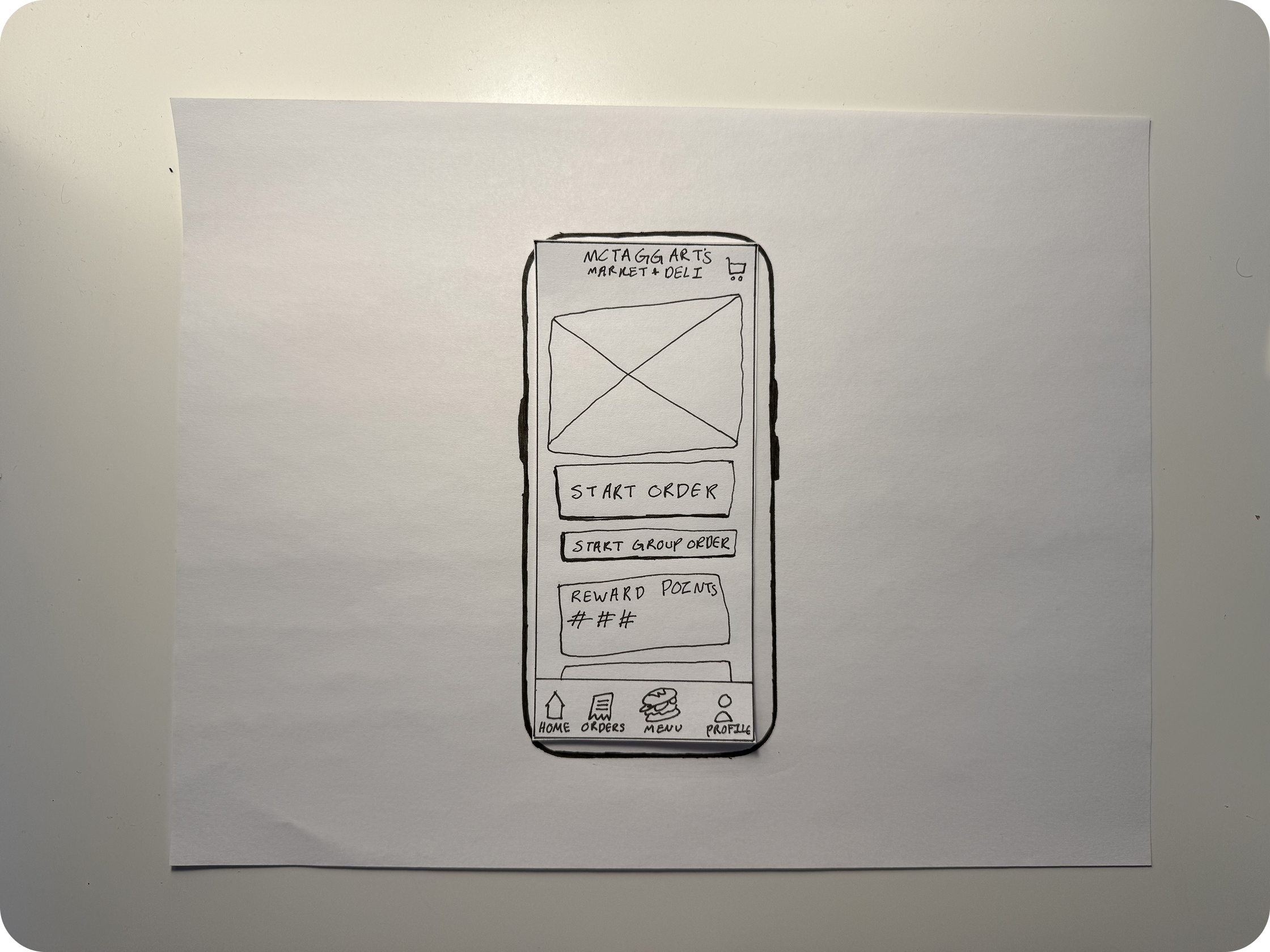
PAPER PRTOTYPING
Early paper prototype testing revealed that users struggled most with understanding how to join and manage group orders. Many expected clearer cues for who created the order and what actions they could take, which led me to simplify entry points and make group roles more visible.
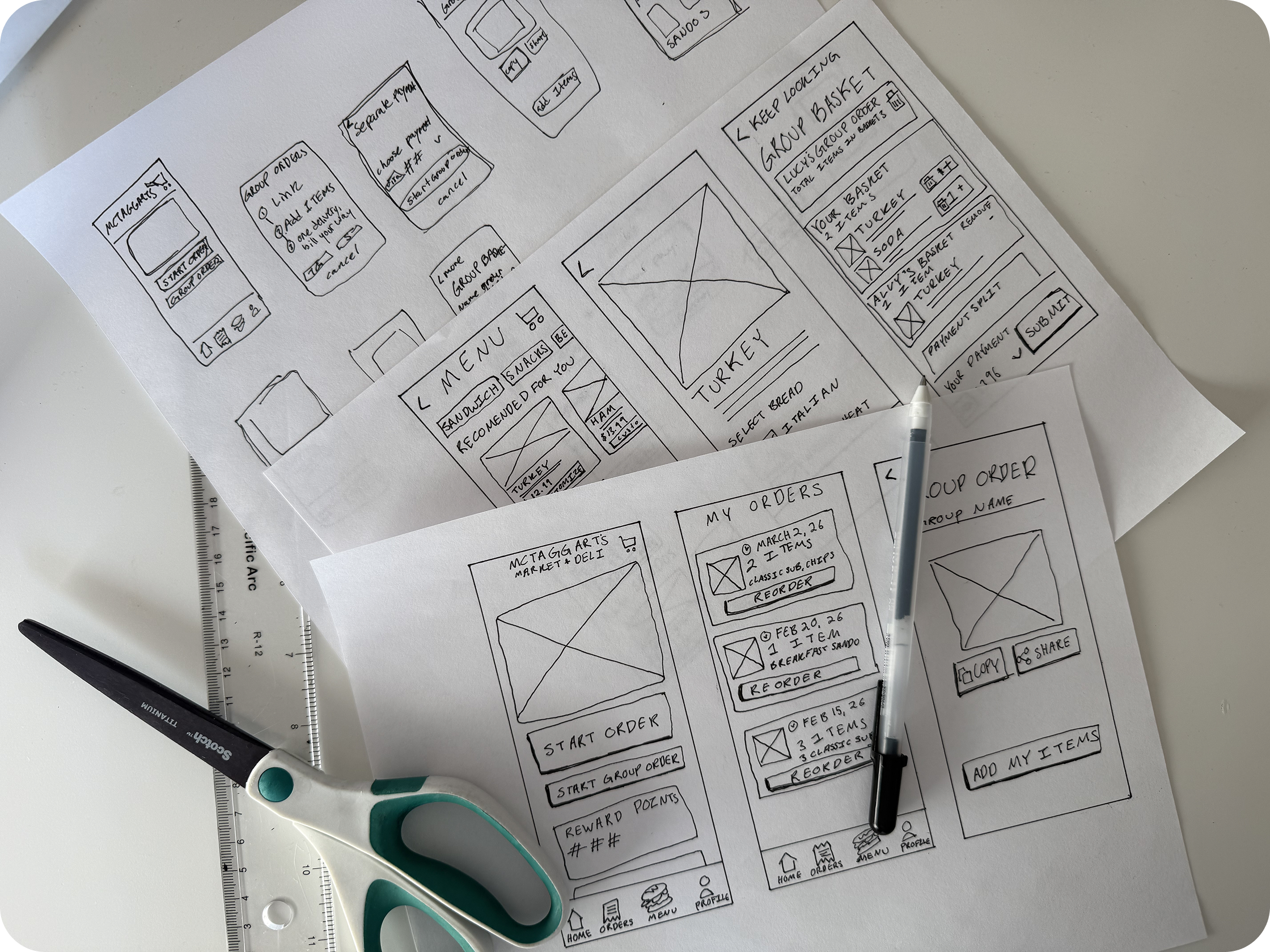
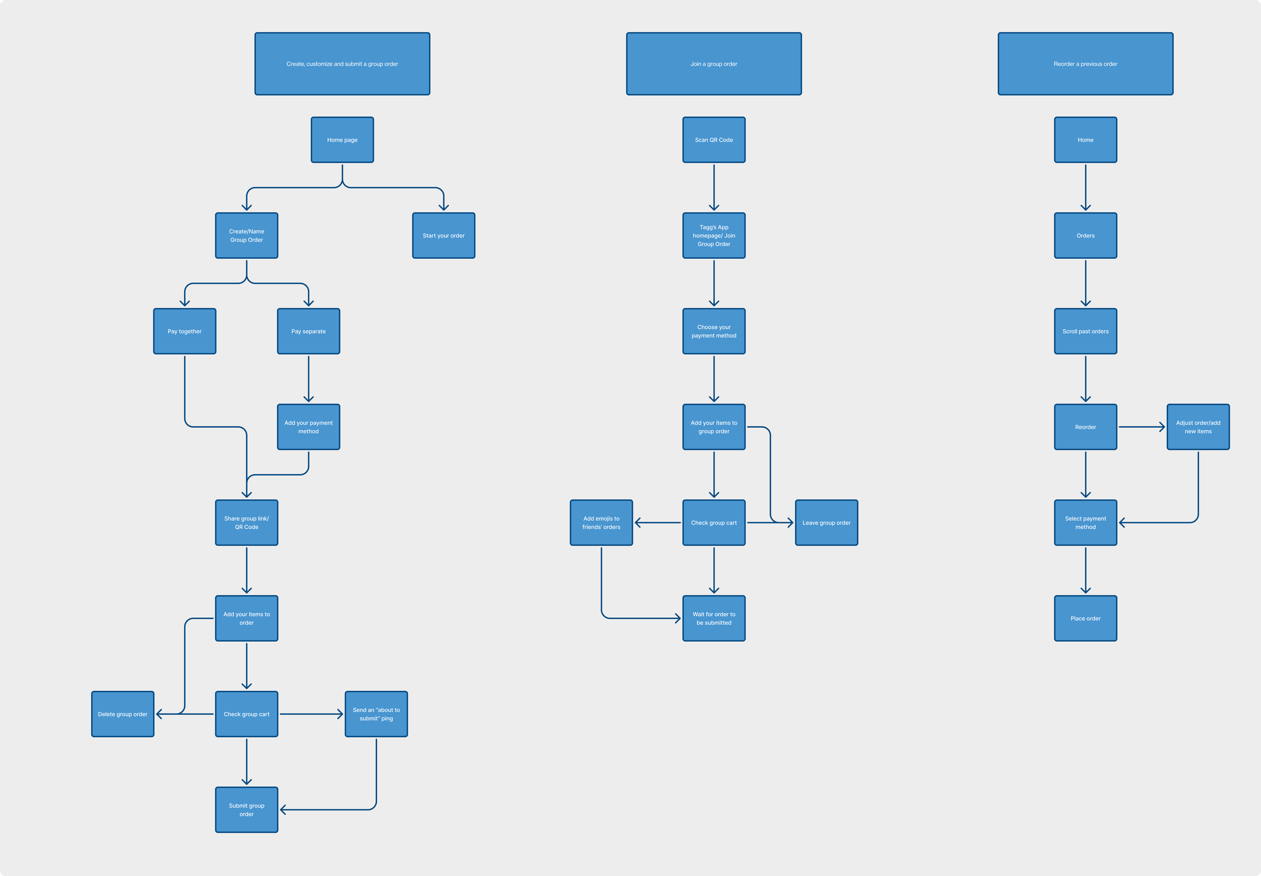
User Flow Charts
Mapping user flows helped me realize how quickly the group ordering process became overly complex, especially when users switched between creating, joining, and editing orders. This led me to streamline flows and reduce unnecessary steps, particularly for re-ordering and joining.
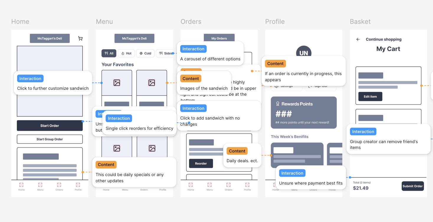
Lo-Fi Wireframing
Creating wireframes made it clear that users naturally look for past orders when deciding what to get. Re-ordering felt buried, so I prioritized it by adding past orders to the bottom navigation, making it a primary and easily accessible action.
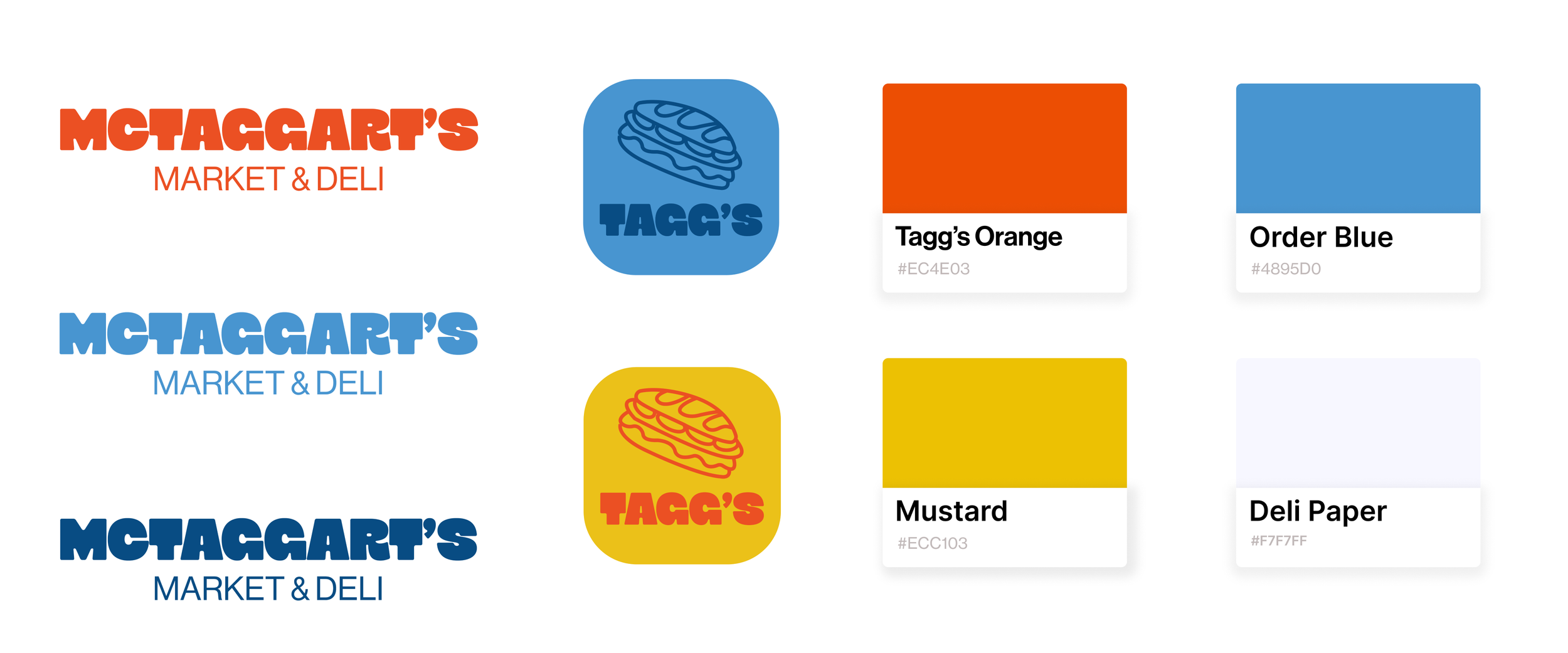
BRAND IDENTITY
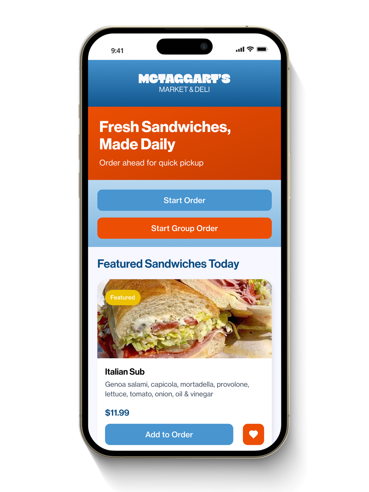
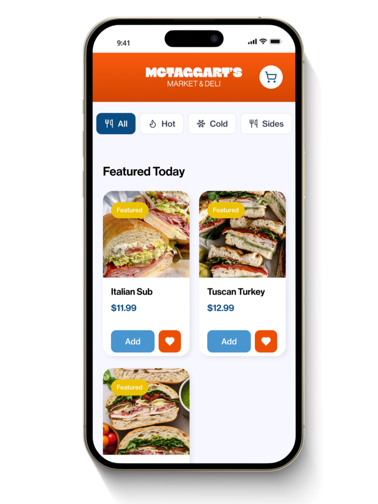
PROTOTYPE
I created a high-fidelity, interactive prototype in Figma to validate core Tagg’s ordering flows. The prototype focused on:
Simplifying individual and group ordering
Streamlining customization and checkout
Prioritizing quick reordering through past orders and favorites
Highlighting daily deals and promotions for easy discovery
KEY TAKEAWAYS
Reducing friction in ordering flows increases speed and completion rates.
Prioritizing past orders and favorites makes reordering feel effortless.
Designing for groups strengthens usability in real-world ordering scenarios.